Building CloudHire's B2C Mobile App
Taking a web product 0-to-1 into a native mobile experience
Role: GTM Product Lead · Scope: B2C Candidate Platform (iOS & Android) · Team: Product & Engineering
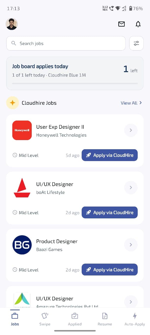
Jobs board
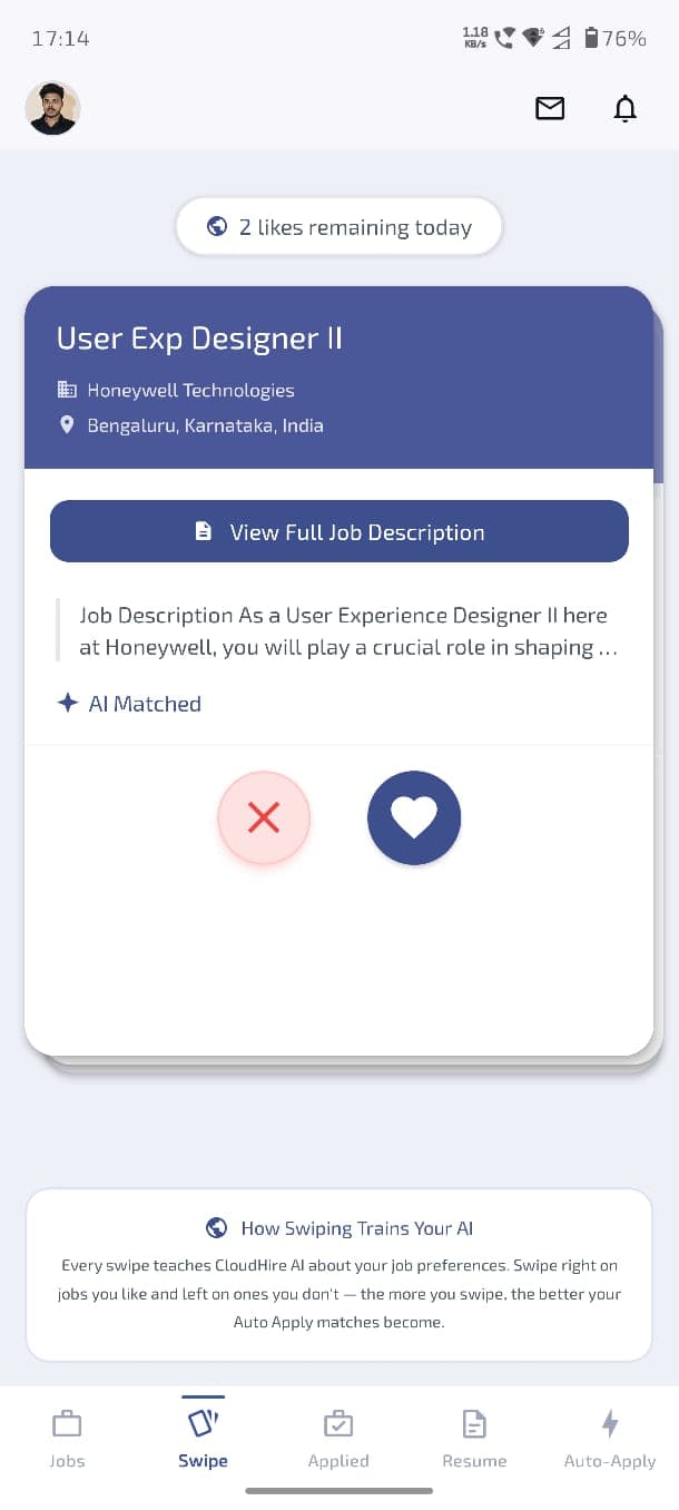
Swipe to Apply
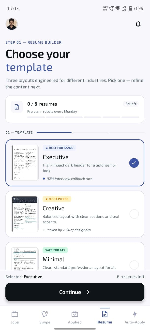
Resume builder
The problem
CloudHire's B2C product ran on the web — accessible across desktop and mobile browsers, with a strong and active user base and a proven onboarding flow. The AI job-matching, Auto Apply, resume tools, and career features all worked.
What it didn't have was a native app. In a market where job seekers live on their phones, a browser experience only goes so far — no home-screen presence, no push, no native feel, and a mobile web flow that was never designed as the primary way in. The mandate was to launch CloudHire on mobile for the first time: a native iOS and Android app.
This was a 0-to-1 build, not a port. The web product told us what the capabilities were; it didn't tell us how they should work when the experience is rebuilt around a native app, a smaller surface, and a user who decides in seconds whether it's worth keeping. And it wasn't a replacement — the web product remains central and fully in sync with the app; new features still land on web first, and the two stay consistent as the product evolves. The job was to bring CloudHire to native mobile in a way that stood on its own.
I led the product and growth side of the app end to end — owning the journey, the activation strategy, the monetisation and referral mechanics, the user flows, and the outcomes across the whole experience, with hands-on implementation on parts of the build.
How I framed it
A mobile launch could have been scoped as recreating the web product in an app. I scoped it around a different question:
Where does a new user actually feel value, and how fast can we get them there?
In a browser, CloudHire had the room to let users explore. In a native app, that latitude disappears — a user who opens the app and doesn't reach a matched job in the first session usually doesn't come back for a second. So the whole build was organised around one progression, and everything else was in service of it:
Account created → Setup complete → Jobs matched → First action taken
That reframing decided what to prioritise. Onboarding wasn't a registration step to get past — it was the activation path. Referral wasn't a feature to add — it was an acquisition loop that only works if it's placed at the right moment. The paywall wasn't a gate — it was a decision that had to land when intent was real, not before.
Shaping the journey
Before any screens, I mapped how CloudHire's parts should connect on mobile:
Sign Up → Onboarding → Resume / Profile → Job Recommendations
→ Apply / Auto Apply → Career Tools → Upgrade → Referral
Mapping it this way showed where users could stall, where strong intent gave us a natural place to introduce a growth mechanic, and where the sequence itself could be used to build momentum toward the first matched job.
Onboarding as the activation path
CloudHire's match quality depends on understanding the candidate — role, experience, skills, preferences, resume. That made onboarding inseparable from activation: the information we needed to deliver value was the same information that, collected badly, would cause users to drop.
So I designed the flow so value stayed visible the whole way through, ending at the moment the product proves itself:
Email & OTP → Resume Upload → Preferences (pre-filled from the
resume, user verifies and completes) → Matching Jobs Shown →
Select Jobs to Auto-Apply → Review Emails & Send → Success →
Referral → Pricing
The most deliberate decision was the auto-apply moment. The applications could have been sent silently in the background — technically simpler, one less step. I designed it the opposite way: the user selects the jobs, sees the actual emails being sent on their behalf, and lands on a success confirmation. A background process produces no feeling; a visible one produces proof. That proof is what earns the activation, and what makes the upgrade and referral asks that follow land on a user who has already seen the product work.

Enter email

Resume upload
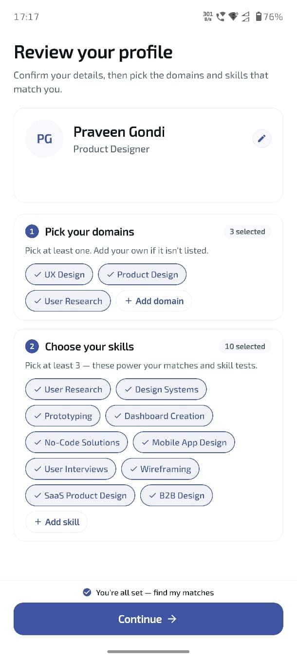
Preferences (pre-filled)
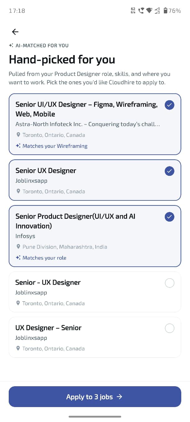
Select jobs to auto-apply
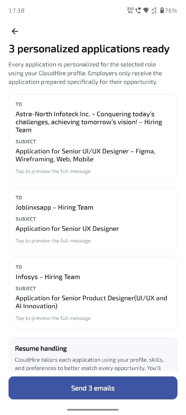
Review emails & send
The growth decisions
Activation
The failure mode for a first mobile session is a user who finishes signup and lands on an empty home screen with no reason to stay. Every decision in the early journey — resume-driven pre-fill, showing matched jobs before asking for anything speculative, the visible auto-apply — existed to close the distance between "account created" and "first real action" inside the first session.
The early funnel held up well. Of users who opened the app, the drop from app-open through OTP verification stayed tight — 2,340 app-opens → 2,188 OTP requested → 2,036 OTP verified, roughly 87% through verification, a strong top-of-funnel for a first release.
Monetisation — tied to intent, not to signup
I designed the upgrade moment around usage-based limits that surface when a user is actively trying to use a capability — the point where value is already understood and intent is highest. A prompt placed there is anchored to what the user is doing, not shown at a moment they have no reason to act on.
Wants to use feature → Reaches usage limit → Value already
proven → Upgrade opportunity
Access was tiered, and the paywall presented three clear paths at the end of onboarding: a plan users can buy directly in-app, a higher tier with the option to book a call with sales, and a free path to continue. The upgrade decision was anchored to real intent instead of being forced before the user had a reason to say yes.
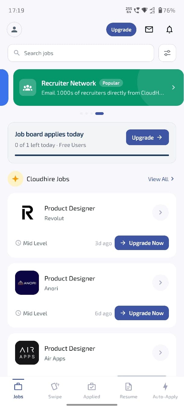
Usage limit reached
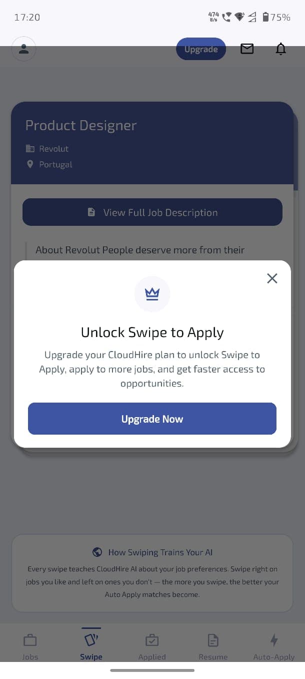
Upgrade pop-up
Acquisition — a referral loop timed to value
The web product had no referral system. With an active user base, existing users were a real acquisition channel — but a referral ask only works if it arrives when the user feels good about the product, not at signup when they've felt nothing yet.
I designed the mechanic around a mutual credit reward — invite a friend, both sides unlock free applications once the friend completes onboarding — and placed it immediately after the user reached value, with jobs matched and auto-applied.
The placement is validated in the data: of the 2,340 users who opened the app, 1,500+ (roughly two-thirds) reached and engaged with the referral screen. This confirms that asking for a referral only after a user sees jobs matched and auto-applied is the right trigger.
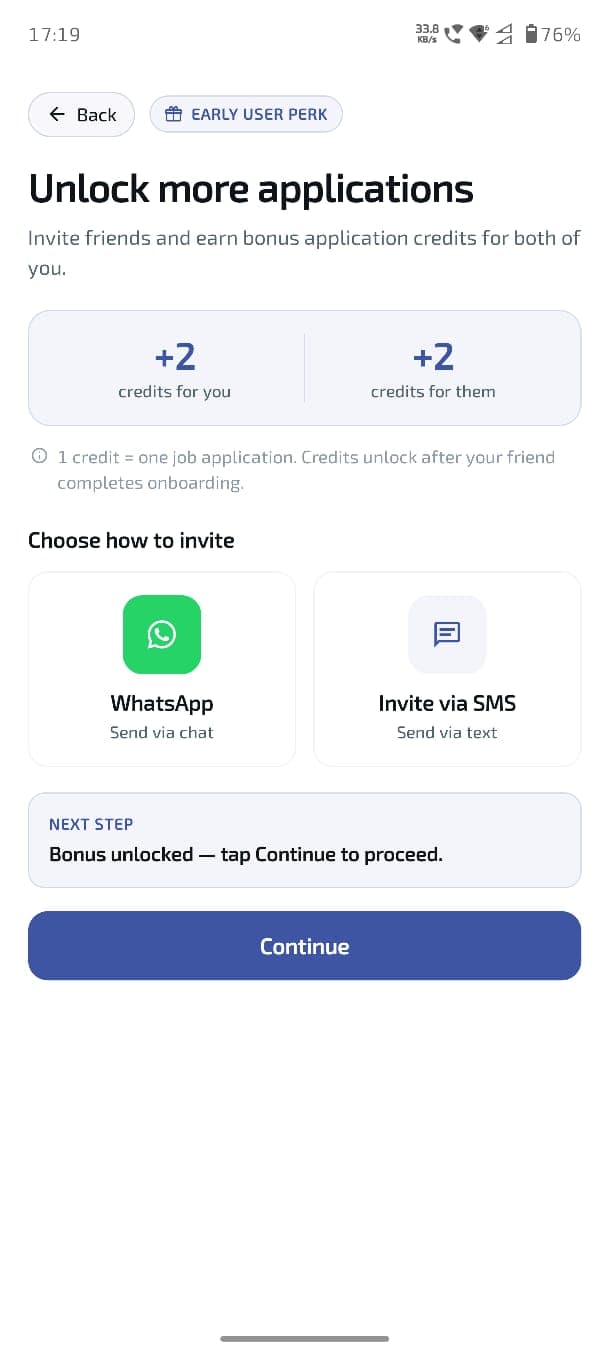
Referral entry point
Build & collaboration
The app was built across Product and Engineering, and my job was to make sure the product intent held up across the whole experience — from decision to shipped screen. I owned the user flows and journey mapping, defined what each part of the product needed to do, prioritised the work, and stayed close to engineering through feasibility and trade-offs as the build came together.
Product → Engineering discussion → Feasibility → Trade-offs →
Implementation → QA → Iteration
Engineering built the core of the app. On the surfaces where the growth logic and interaction detail were most tightly coupled — onboarding, referral, the usage-limit and upgrade pop-ups, and the jobs screen — I moved into implementation myself, using Cursor and Claude Code to ship frontend components directly into the React Native codebase. That kept the product decision and the shipped experience in sync and let engineering stay focused on the heavier platform work. When an approach wasn't feasible, I worked with them to find an alternative that still delivered the outcome.
Through launch and beyond. I validated the key journeys with engineering and QA — signup, onboarding, job discovery, auto-apply, upgrade, referral — and coordinated the launch across both stores. The App Store review around login and onboarding, for example, required us to clearly justify why onboarding data was needed for the personalised experience. Since launch I've owned the app as a live product, not a finished project: watching how users move through the whole experience, reading the funnel, and continuing to iterate on activation, conversion, and retention across the app — while keeping it in sync with the web product as new features roll out.
Outcome
The project delivered CloudHire's first native mobile product — an iOS and Android app that brought the web experience onto a new platform, with activation, monetisation, and acquisition mechanics designed specifically for mobile.
Shipped at launch:
- CloudHire's first native iOS and Android app
- Resume-driven onboarding with pre-filled preferences
- Mobile job discovery and single-tap apply
- Auto-apply with visible send and success confirmation
- Resume / ATS, AI Interview, Cloud ID, Skill Certificates
- Usage-based upgrade intent and a three-option paywall
- A new mutual-credit referral loop
Early traction:
- 7,000+ installs across iOS and Android
- ~46% store conversion rate (App Store & Play Store store-listing view-to-install, per App Store Connect and Play Console)
- 87% app-open to OTP-verified through the top of the onboarding funnel
- 2 in 3 app-openers reached and engaged the value-timed referral screen
Introduced CloudHire's first self-serve mobile monetisation path — capturing upgrade intent directly in-app, at the point of proven value, without cannibalising the enterprise sales-call motion.
The install volume proved demand. The signal I cared about more was that the moments I designed deliberately — the visible auto-apply, the intent-timed paywall, and the value-timed referral — performed in the live product on the very first version.
Reflections
Scoping the launch around first value, not feature parity, decided everything. Organising the build around the fastest path to a matched job is what made it a mobile product rather than a mobile copy — and it's what the funnel and referral reach reflect.
Growth mechanics work when they're placed at intent. The referral reached two-thirds of app-openers because it was asked after proven value, not at signup. Placement was the product decision, not the mechanic itself.
Owning the outcome, not just the parts. I led the product across the whole app and took the growth-critical surfaces into implementation myself — but the job didn't end at ship. Owning how the entire experience performs, and continuing to improve it, is where the real work is.